
Building a financial reporting dashboard no longer requires complex coding skills or a team of developers. With the rise of no-code platforms, anyone can create a powerful, data-driven dashboard tailored to their financial needs. In this guide, we’ll walk you through the step-by-step process of building your own financial reporting dashboard using Knack’s no-code platform.
Key Takeaways
- A financial reporting dashboard is a visual tool that consolidates and displays key financial metrics and data to provide real-time insights into an organization’s financial performance.
- A financial reporting dashboard should track high-level use cases such as revenue monitoring, expense management, profit/loss analysis, cash flow tracking, and budget vs. actual performance. Key metrics to include are total revenue, total expenses, net profit, cash inflows/outflows, and financial ratios like current ratio and return on equity.
- No-code platforms allow users to create financial reporting dashboards by customizing data structures, integrating financial data, and designing visualizations without coding skills. Users can easily drag and drop components, connect to financial systems, and automate data updates to create a dynamic and user-friendly dashboard.
What is a Financial Reporting Dashboard?
A financial reporting dashboard is a visual tool that aggregates and displays key financial metrics and data in a centralized, easy-to-understand format. It typically includes charts, graphs, and tables that provide real-time insights into an organization’s financial performance. They allow users to monitor important indicators such as revenue, expenses, profit margins, and cash flow at a glance by consolidating data from various sources.
With the increasing complexity of financial data and the need for timely decision-making, businesses require tools that provide clarity and transparency. A well-designed financial dashboard offers executives, managers, and financial teams the ability to track performance, detect issues early, and respond swiftly to changing market conditions. In essence, a financial reporting dashboard is a critical component for effective financial oversight and strategic planning.
Financial Dashboard Examples
Financial reporting dashboards aren’t one-size-fits-all; there are numerous types of dashboards to choose from. We’ve broken down the top 10 types of financial dashboards below.
CFO Dashboard
CFO dashboards integrate data from finance, operations, and other business systems, providing a comprehensive view of an organization’s overall performance. By consolidating information from disparate sources—such as financial statements, sales data, inventory levels, and HR metrics—CFO dashboards enable financial leaders to monitor key performance indicators (KPIs) in real-time.
These financial dashboards allow CFOs to see the interconnections between different aspects of the business, identify trends, and make informed strategic decisions. Ultimately, CFO dashboards enhance transparency, streamline reporting, and support proactive financial management by offering a holistic perspective that bridges the gap between financial data and operational realities.
Cash Flow Valuation Dashboard
Cash flow valuation dashboards are designed to present a detailed analysis of an investment’s financial performance by focusing on key metrics such as the internal rate of return (IRR), detailed cash flow tables, and the categorization of different investment types. These dashboards help investors and financial managers understand the expected rate of return over the life of an investment and track incoming and outgoing cash flows over time.
Cash flow valuation dashboards can also segment and analyze various types of investments, allowing users to compare performance across different asset classes, assess risk, and make more informed decisions. This comprehensive data visualization enables a clear assessment of an investment’s viability and long-term profitability.
CAGR Dashboard
CAGR dashboards display the compound annual growth rate (CAGR) of investments or business metrics over multiple time periods alongside the assets under management (AUM). They provide a clear visualization of how an investment or portfolio has grown over time, averaging the annual growth rate across a specified duration, which helps understand the long-term performance trend.
By incorporating AUM data, CAGR dashboards give a snapshot of the total value of assets managed, allowing users to see how the growth of these assets correlates with the overall financial health and performance of an investment portfolio. This dual focus on CAGR and AUM offers investors and financial managers a powerful way to track progress, compare performance across different periods, and make strategic decisions based on growth patterns.
Expense Detail Analysis Dashboard
Expense detail analysis dashboards allow users to explore the intricate relationships between various data values, providing deep insights into spending patterns and cost management. They enable the creation of custom tables that can be tailored to specific analytical needs, allowing users to segment, filter, and drill down into detailed expense data.
This type of financial reporting dashboard ensures that the data can be easily shared, further analyzed, or integrated into broader financial reports. This flexibility in data manipulation and reporting empowers organizations to better understand their expenses, identify areas for cost savings, and optimize their financial strategies.
Option Valuation and Greeks Dashboard
Option valuation and Greeks dashboards include options price calculators, allowing users to input parameters such as strike price, volatility, and time to expiration to determine the fair value of options. They feature dynamic charts that visually represent how changes in these input values affect the option’s price.
These financial dashboards also calculate and display key Greeks—delta, vega, rho, and theta—which measure the sensitivity of the option’s price to different factors like changes in the underlying asset’s price, volatility, interest rates, and time decay. By providing these calculations and visualizations, the dashboard enables traders and financial analysts to better understand and manage the risks of options trading.
Margin Analysis Dashboard
Margin analysis dashboards offer financial institutions and lenders an interactive view of loan portfolio data and its performance over time. They enable users to analyze the profitability of individual loans and entire portfolios by visualizing key metrics such as interest margins, default rates, and return on assets.
Margin analysis dashboards allow users to filter data by loan type, time period, or borrower characteristics, providing a granular understanding of how different segments of the portfolio are performing. These dashboards help identify trends, assess risk, and optimize lending strategies, ultimately supporting better financial decision-making and portfolio management.
Risk-Adjusted Performance Dashboard
Risk-adjusted performance dashboards analyze commercial loan portfolios by incorporating risk metrics into the assessment of portfolio performance. They typically include charts that visualize loan utilization rates—how much of the available credit is being used—and exposure, which measures the potential loss if borrowers default.
By adjusting performance metrics for risk, such as credit risk or interest rate risk, these dashboards provide a clearer picture of the true profitability and stability of the loan portfolio. This allows financial managers to identify high-risk areas, optimize capital allocation, and make informed decisions that balance return with risk.
FX Sales Analytics Dashboard
FX sales analytics dashboards offer currency trading managers comprehensive data on key aspects of foreign exchange (FX) trading. They provide detailed insights into trading volumes, helping managers track the amount of currency traded over specific periods.
These dashboards also display margins and revenues, allowing managers to assess profitability and identify trends in trading activities. FX sales analytics dashboards enable managers to monitor performance, optimize trading strategies, and make informed decisions that enhance profitability and efficiency.
Profit Simulations Dashboard
Profit simulations dashboards evaluate the relationship between price per unit and total profit, providing crucial insights for optimizing pricing strategies. These dashboards allow users to input different price points and instantly see how changes affect overall profitability, considering factors such as production costs, sales volume, and market demand.
Profit simulation dashboards help businesses identify the optimal price that maximizes profit while remaining competitive. This dynamic analysis helps make data-driven decisions and lets companies fine-tune their pricing strategies to achieve the best financial outcomes.
Break-Even Analysis Dashboard
Break-even analysis dashboards are essential for making informed investment decisions and setting prices by mapping the relationship between total profit and total sales. They depict the point at which total revenue equals total costs, indicating the break-even point where a business neither profits nor loses money.
By analyzing this relationship, users can determine the minimum sales volume needed to cover costs and the impact of different price levels on profitability. This insight is crucial for setting appropriate prices and evaluating the financial viability of investments.
Building Your Financial Reporting Dashboard with Knack (No-Code)
Knack is an intuitive no-code platform that can be used to build comprehensive, effective financial reporting dashboards. Below is the step-by-step process for building a financial dashboard with Knack. If you need more guidance, be sure to check out our knowledge base and developer documentation.
1. Define the Structure of Your Financial Dashboard
Before you start building your financial reporting dashboard, it’s crucial to outline the key financial metrics you want to track. Clearly defining these metrics will ensure that your dashboard effectively monitors the most important aspects of your organization’s financial health. Here are some common elements to consider:
- Revenue: This is the total income generated from sales or services before any expenses are deducted. Tracking revenue helps you understand the effectiveness of your sales strategies and market performance.
- Expenses: These include all the costs incurred by your business, such as operating expenses, payroll, and overhead. Monitoring expenses allows you to identify areas where you can reduce costs and improve efficiency.
- Profit/Loss: This metric calculates the difference between revenue and expenses, showing whether your business is making a profit or operating at a loss. It’s a fundamental indicator of your business’s financial performance.
- Cash Flow: Cash flow tracks the movement of money in and out of your business. Positive cash flow indicates that your business can meet its obligations, reinvest, and grow, while negative cash flow might signal financial challenges.
- Budget vs. Actual: This comparison highlights the variance between your projected financial goals and your actual performance. It helps assess how well your financial planning aligns with reality and where adjustments may be needed.
- Key Financial Ratios: These ratios, such as the current ratio, debt-to-equity ratio, and return on equity, provide deeper insights into your business’s financial stability, liquidity, and profitability. They are essential for evaluating the overall financial health and making informed strategic decisions.
2. Set Up Your Knack Account in 30 Seconds
If you don’t already have a Knack account, you’ll need to sign up for one to create your financial dashboard. Follow these simple steps:
- Visit Knack’s website.
- Click the “Start Building for Free” button in the top right corner.
- Enter your email and create a password.
- Select the “Create Account” button.
3. Create Your Financial Reporting Dashboard App
Once you’ve created your account, you’ll automatically be directed to the app builder. From here, you can start building your financial dashboard by doing the following:
- Select the purple + in the “Create a New App” section.
- Choose whether you want to build your dashboard app from scratch (blank app) or by importing data. For this tutorial, select the “Start from Scratch” option.
- Choose a relevant name for your app and enter it in the box in the top left corner next to the purple home button.
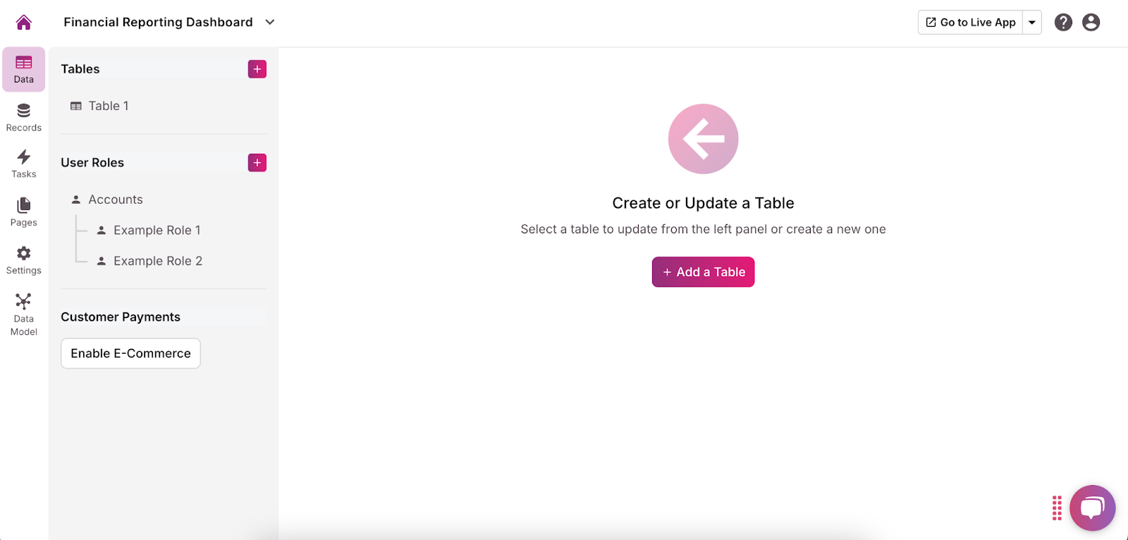
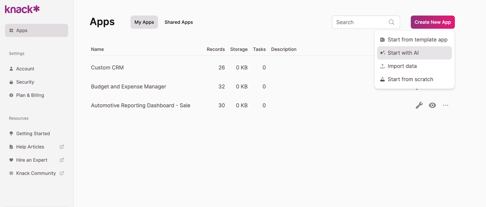
Alternatively, you can build your dashboard using our intuitive AI app builder. Here’s how:
- From your app builder, select “Start With AI.”
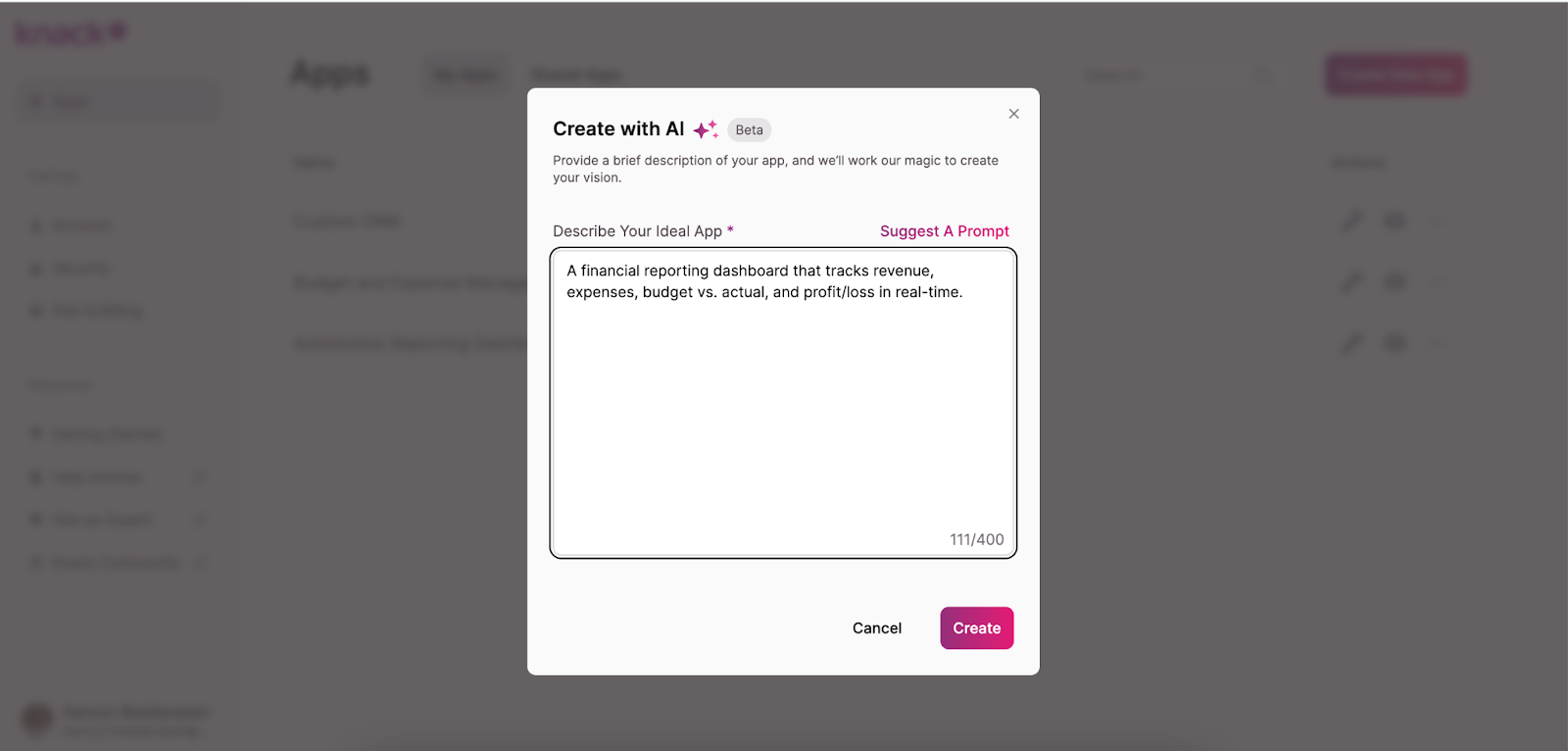
- Input a prompt that describes the dashboard you’re looking to build, such as “A financial reporting dashboard that tracks revenue, expenses, budget vs. actual, and profit/loss in real-time.” The AI will propose an initial app structure for you.
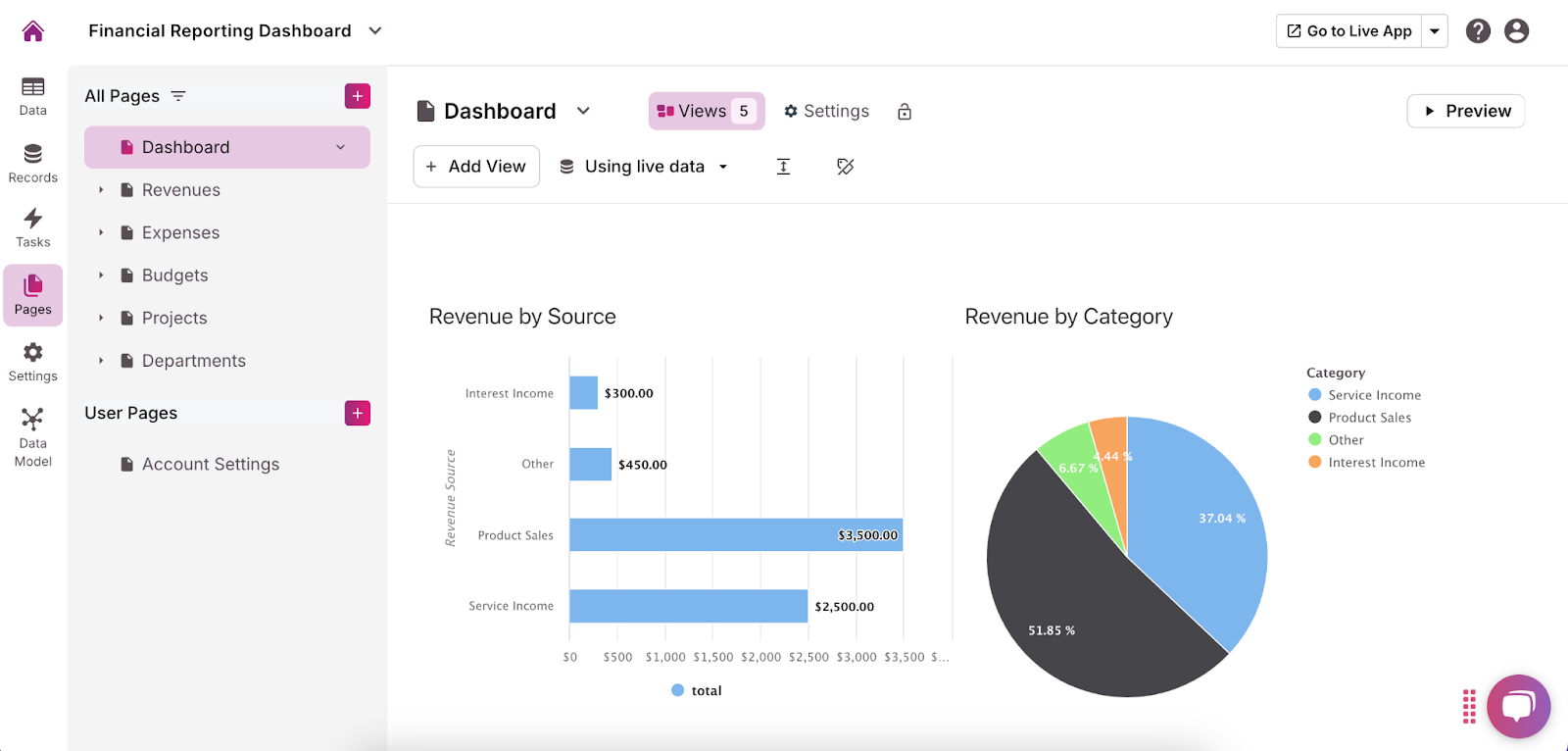
- Refine your data structure, set user roles and permissions, build pages and views, and customize the user interface to ensure the AI-generated app fits your specific needs.
4. Build Your Database Structure and Connections
Now that your app is set up, it’s time to build the backbone of your financial reporting dashboard: the database structure. A well-organized database is crucial for accurate and insightful reporting. This step involves thinking critically about your reporting needs and ensuring that all necessary data points are included.
- Add a Table: Click the purple “Add a Table” button. In the top left corner, select “Blank Table.” Give the Table a relevant name.
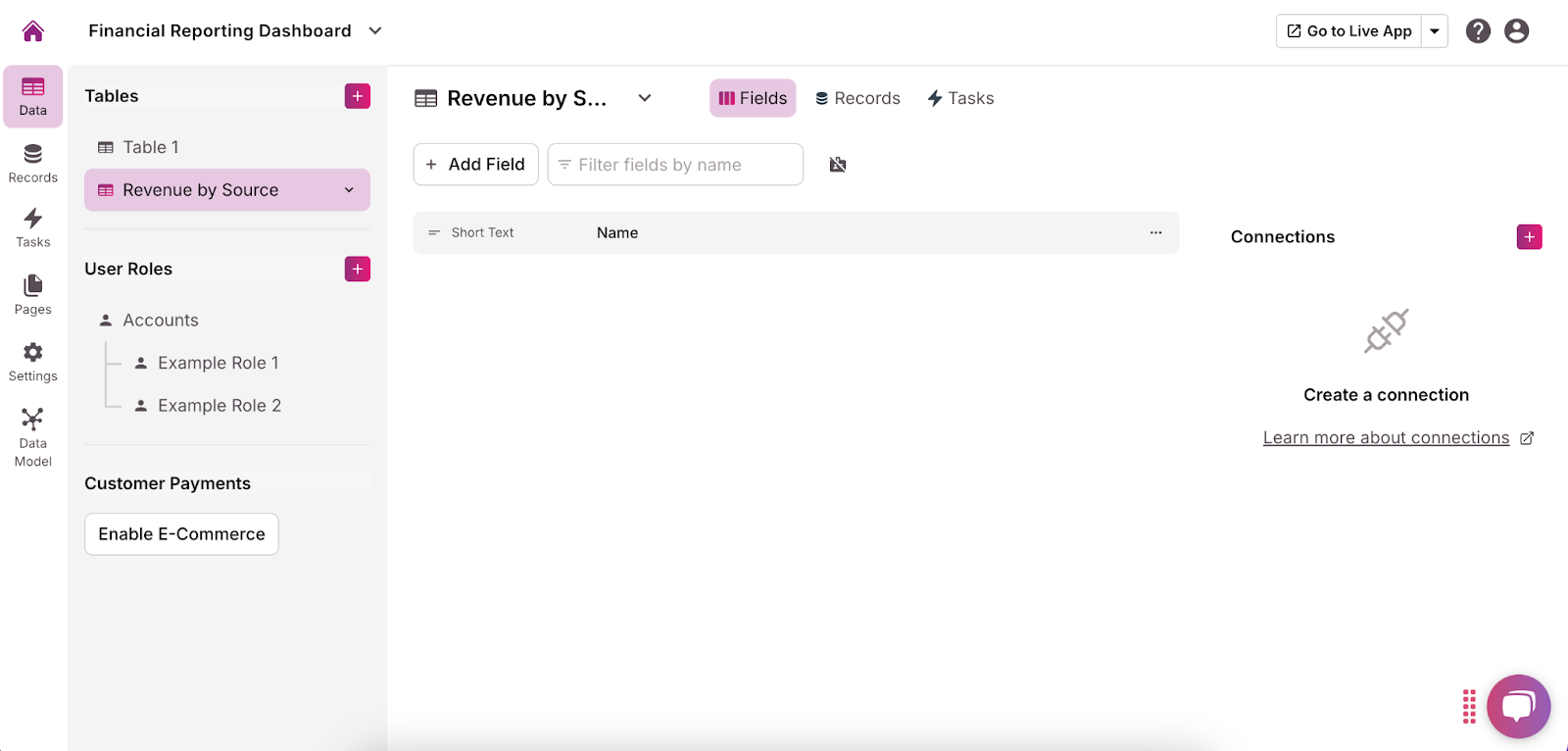
- Identify Key Data Objects and Fields Define the primary objects that will hold your financial data. Each object should represent a core financial component. For each object, create the relevant fields to capture specific details. You can do this by selecting the “Add Field” button below your table’s name and choosing how you want users to be able to enter information for that field. Here’s how you can approach each:
- Revenue: Create fields like Date (Date/Time), Revenue Source (Short Text), Amount (Currency), and Category (Multiple Choice/Dropdown: Sales, Services, etc.). These fields will allow you to categorize and track all revenue streams.
- Expenses: Add fields such as Date (Date/Time), Expense Type (Text), Amount (Currency), and Category (Multiple choice/Dropdown: Operational, Payroll, etc.). This helps categorize expenses and analyze spending patterns.
- Profit/Loss: Create a summary object that calculates profit or loss based on your Revenue and Expenses objects. Include a Profit/Loss Amount field (Calculated Field: Revenue – Expenses).
- Cash Flow: Set up fields like Date (Date/Time), Cash Inflow (Currency), Cash Outflow (Currency), and Net Cash Flow (Calculated: Cash Inflow – Cash Outflow) to monitor the cash moving through your business.
- Budget vs. Actual: For budget tracking, add fields like Category (Dropdown: Sales, Operational, etc.), Budgeted Amount (Currency), Actual Amount (Currency), and Variance (Calculated Field: Budgeted – Actual). This comparison is crucial for managing financial expectations and outcomes.
- Financial Ratios: Create fields such as Ratio Name (Text) and Value (Calculated Field or Input) to store and calculate important financial ratios like current ratio or return on equity.
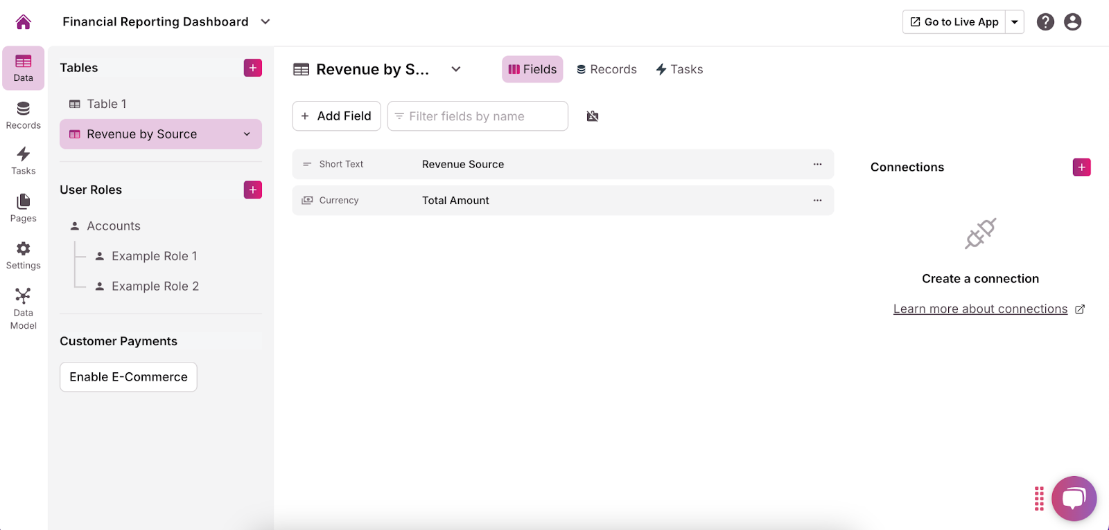
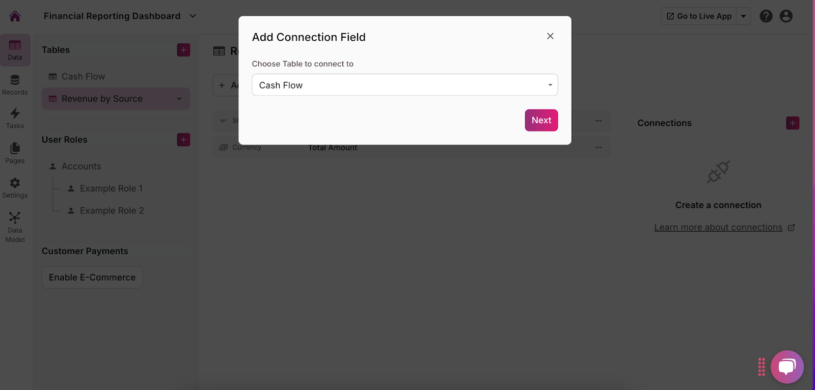
- Establish Connections Between Tables Once you have created your tables, it’s important to link them appropriately to create a cohesive and functional database. To do this, click the purple + next on the right corner of the screen of the table you want to connect. From the dropdown, select which table(s) you want to connect it to, then click “Next.”
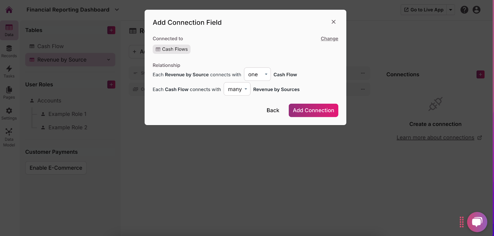
- Define Table Relationships: Define the relationships between tables to control how they interact (one to many, many to one, etc.) and click “Add Connection.”
5. Integrate Your Financial Data Sources
With your database structure in place, it’s time to integrate your financial data. Integrating data from various sources is essential to ensure your financial reporting dashboard provides a comprehensive and accurate view of your business’s financial health. You can do this in three ways:
- Connect Existing Systems Through Direct Integration: Knack offers pre-built integrations with many financial systems, such as Freshbooks and Xero. To connect your existing systems using available integrations, you must make an account with Zapier or Make. Then, return to your app builder and click the “Settings” button in the menu on the left side of the screen. Next, click “API & Code.” This will show you your unique application ID and API key. You can enter these into your Zapier or Make settings to connect them to Knack.
- Import Data from Spreadsheets or Databases If you manage financial data in spreadsheets or other databases, Knack allows you to import this data directly. This is particularly useful for bringing in historical data or setting up initial records. Do this by adding a new table and selecting “By Import.” Then, upload your CSV or Excel file or select the Google Sheets option. Make sure your column headers match the fields in your Knack app.
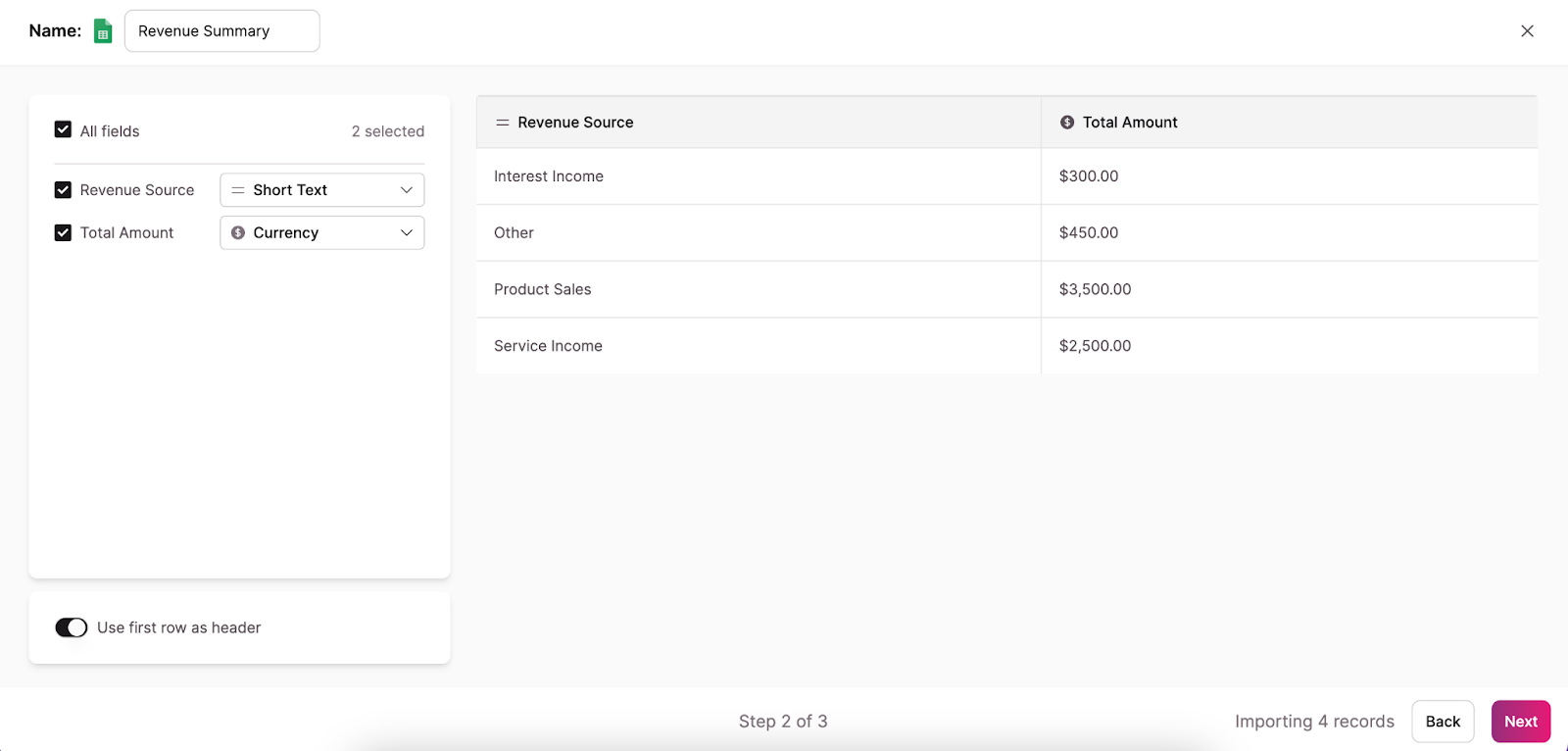
- Use APIs: If your financial data resides in more complex systems, or if you require custom data flows, consider utilizing APIs to pull data directly into Knack. APIs allow for seamless integration between your financial systems and Knack, enabling real-time updates and custom data synchronization. This is also found in the API & Code section of your app builder.
For ongoing financial management, consider setting up automated data imports. This ensures your dashboard always reflects real-time information, reducing manual updates and the risk of outdated data. You can do this within Zapier or Make.
6. Set Up and Customize Your Dashboard Pages
Now that your financial data is integrated into Knack, it’s time to bring that data to life by creating a dashboard that displays your key financial summaries and visualizations. This step is where you’ll design the interface that allows you and your stakeholders to interact with the financial data, analyze trends, and make informed decisions. Follow these steps:
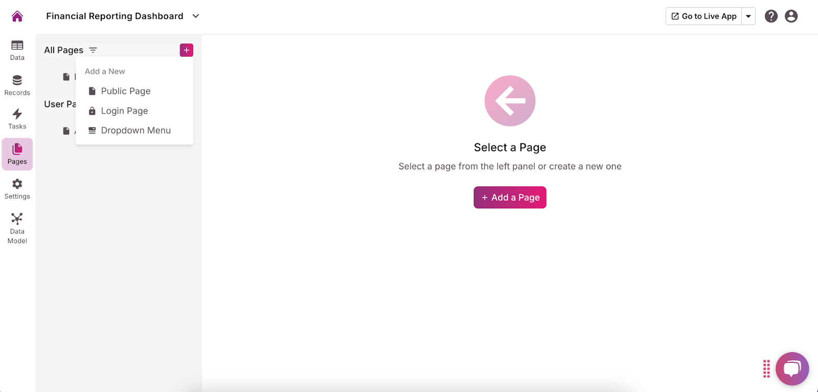
- Create a Dashboard Page Start by creating a dedicated dashboard page in Knack where all your financial summaries and visualizations will be displayed. You can do this by clicking “Pages” in the menu on the left side of the screen, then “Add Page.”
- Set Page Permissions: On the left side of the screen, choose whether you want your page to be public (accessible to anyone with the URL) or private (requires a login to view). Then, click “Next.”
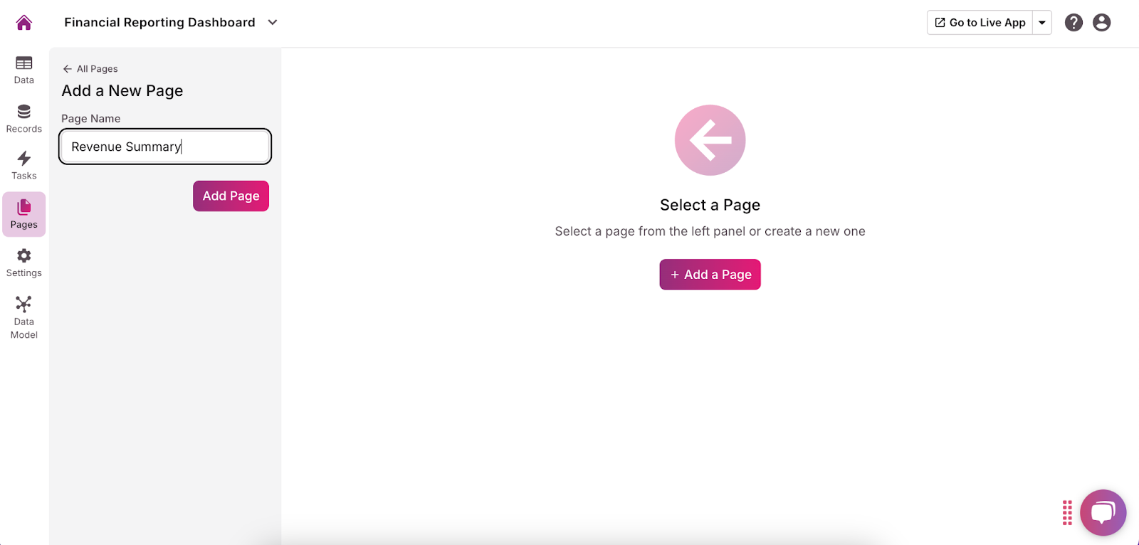
- Name the Page: On the left side menu, give your page a name relevant to the data it will display.
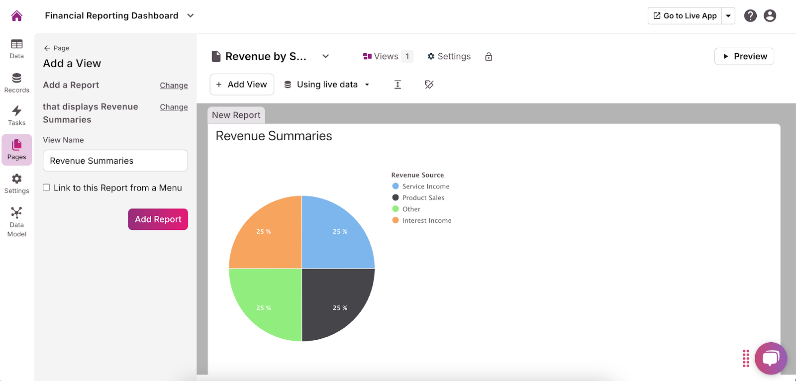
- Add Views: Click the purple “Add a View” button in the center of the screen. Views—charts, forms, grids, and more—are how your data will be displayed to users. Depending on your needs, some views you may want to include are:
- Revenue Summary: Add a chart or grid that displays total revenue. You can enhance this by providing filtering options, such as by date range or revenue category (e.g., Sales, Services).
- Expenses Summary: Similarly, create a chart or grid for total expenses. Include filters for date and expense category (e.g., Operational, Payroll) to help users drill down into specific cost areas.
- Profit/Loss Overview: Add a chart that visualizes profit and loss over time. This could be a line chart showing the trend of profit/loss across different months or quarters, helping users identify patterns and anomalies.
- Cash Flow Statement: Set up a graph that displays net cash flow over time. This visualization can be crucial for understanding the liquidity of your business and how cash is moving in and out.
- Budget vs. Actual: Create a section that compares budgeted amounts against actual spending or revenue. Use bar charts to display each category’s budget versus actuals, and include a variance column or chart to highlight any discrepancies.
- Financial Ratios: Display key financial ratios either as simple text summaries or in small charts. This can include ratios like the current ratio, debt-to-equity ratio, or return on equity, providing quick insights into your financial health.
- Add Your Filters and Sorting Options Filters and sorting options are key to making your views interactive and user-friendly. These features allow users to customize their view and focus on the data that matters most to them.
- Filters: Add filters for date ranges, categories (e.g., revenue source, expense type), and other relevant fields. For example, users could filter the Revenue Summary by a specific quarter or filter the Expenses Summary to only show operational costs.
- Sorting Options: Enable sorting on different metrics, such as sorting the Revenue Summary by the highest revenue or the Expenses Summary by the most significant expense. This makes it easier to identify top-performing or high-cost areas.
- Dynamic Updates: Ensure that any changes made through filters or sorting are dynamically reflected in the dashboard’s charts and summaries, providing real-time insights.
7. Create and Manage Users Permissions
As you finalize the setup of your financial reporting dashboard, it’s crucial to ensure that data integrity and security are maintained by implementing a robust user permissions structure. This allows you to control who can view, edit, or manage different aspects of your dashboard. Follow these steps:
- Define User Roles and Access Levels Begin by clearly defining the different roles within your organization that will interact with the financial reporting dashboard. Common roles might include:
- Administrator: The Administrator role should have full access to all dashboard areas, including the ability to add, edit, and delete data, configure settings, and manage other users’ permissions. This role is typically reserved for senior management or IT personnel responsible for overseeing the dashboard.
- Finance Manager: Finance Managers need access to update and manage financial data, such as entering transactions, adjusting budgets, and running reports. However, they may not need access to administrative settings or user management.
- Analyst: Analysts require access to view and analyze reports but do not need the ability to modify financial data or settings. This role is focused on data interpretation rather than data entry or management.
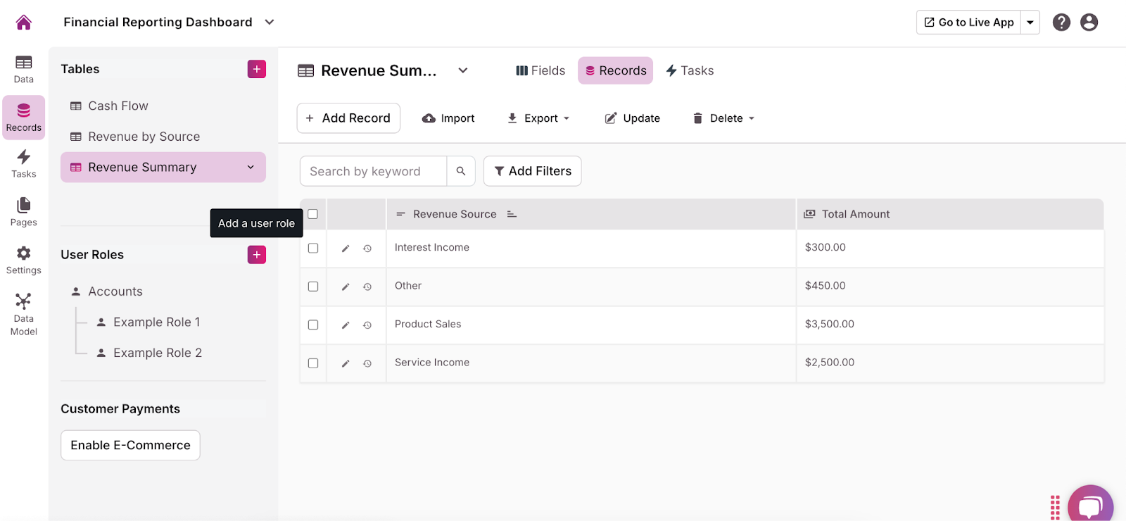
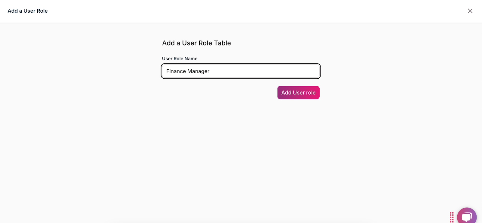
- Create Roles: From the menu on the left side of the app builder, select “Records.” Then, click the purple + button next to the “User Roles” heading. Name the user role, then click “Add User Role.”
- Assign Permissions: For each role, assign the appropriate permissions. For example, Finance Managers should be given the ability to add and update financial data, while Analysts should be restricted to viewing reports without editing capabilities.
8. Customize Public and Private Views:
To make your financial reporting dashboard truly effective, it’s important to tailor the pages and views for different stakeholders within your organization. By creating public views for executives and private views for finance managers or analysts, you ensure that each user sees the information most relevant to their role. Here’s how to do this in Knack:
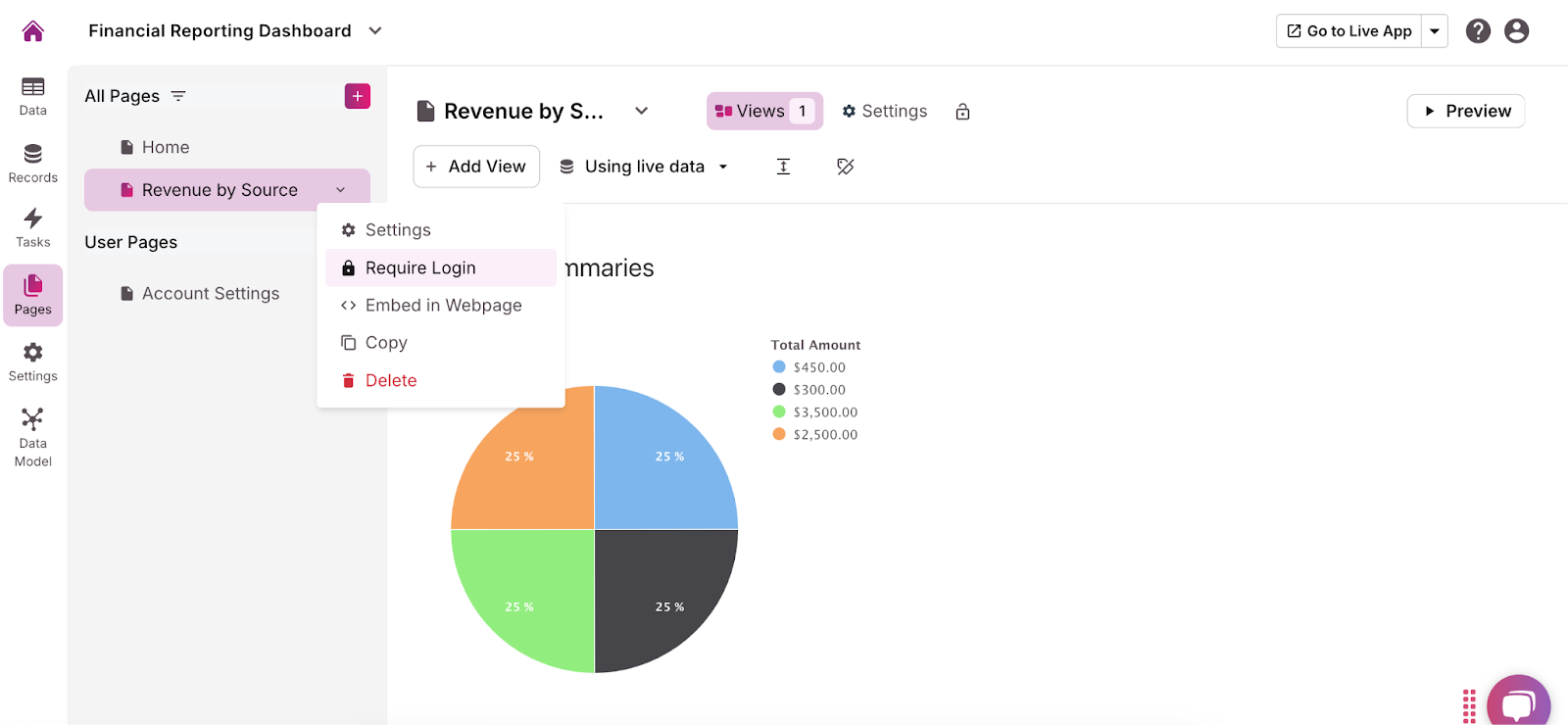
- View Pages: From the menu on the left side of the app builder, click “Pages.”
- Customize View: Next to each page name is a dropdown arrow. For any page you want to make private, click the arrow and choose “Require Login.”
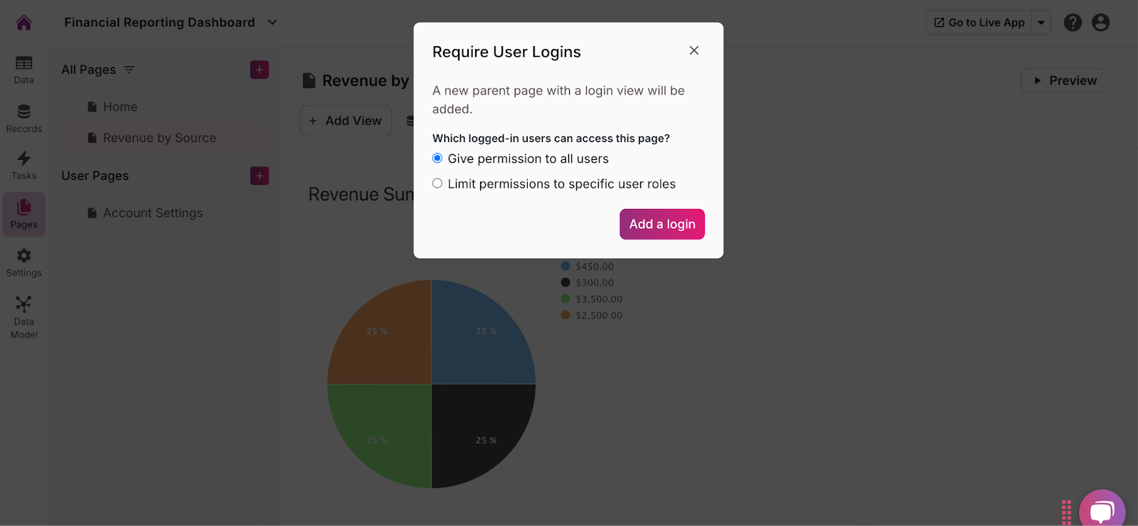
- Set Permissions: In the pop-up, choose who can view the page when logged in. You can allow anyone with a login to view the page or only specific user roles.
9. Test and Launch Your Financial Reporting Dashboard with Knack
Before launching your financial dashboard, you must test it to ensure it works as intended, all data is accurate, and the user experience is smooth. Here’s how:
- Test All Functionalities: Go through each feature and functionality of your dashboard to ensure they work correctly. This includes testing data integrations, calculations, filters, and user permissions. Verify that the charts and graphs display the correct data and that all links and navigation elements function as expected.
- Data Accuracy: Double-check that all financial data is accurate and up-to-date. This is particularly important for calculated fields, summaries, and visualizations. Cross-reference the data in your dashboard with your source data to ensure there are no discrepancies.
- User Experience: Test the dashboard from the perspective of different user roles (e.g., Administrator, Finance Manager, Analyst) to ensure that each role has the appropriate access and that the user interface is intuitive and easy to navigate.
- Collect Feedback from Beta Users Once you’ve completed internal testing, consider conducting a beta test with a small group of users. This can include representatives from different stakeholder groups, such as executives, finance managers, and analysts.
- Invite Beta Users: Select a group of users who represent the key roles within your organization. Provide them with access to the dashboard and ask them to use it as they would in a real-world scenario.
- Collect Feedback: Encourage beta users to provide feedback on their experience, including any issues encountered, useful features, and areas where improvements are needed. This feedback is invaluable for identifying potential problems and making refinements.
- Make Necessary Improvements: Based on the feedback from beta users, make any necessary adjustments to the dashboard. This might involve fixing bugs, improving the user interface, or enhancing certain features to better meet user needs.
- Final Review: Conduct a final review of the entire dashboard to ensure everything is in place and functioning correctly. Double-check user permissions, data accuracy, and overall usability.
- Create Documentation: Prepare user guides, FAQs, or video tutorials to help users understand how to navigate and use the dashboard effectively. This documentation can be especially helpful for new users and those less familiar with the system.
- Plan the Launch: Determine the best time to go live with your dashboard, considering factors like business cycles and user availability. Communicate the launch plan to all relevant stakeholders, so they know what to expect.
- Monitor the Launch: Keep a close eye on the dashboard’s performance during the initial launch phase. Be prepared to address any issues that arise quickly, such as data inaccuracies or technical glitches.
- Gather Ongoing Feedback: Continue to collect feedback from users after the launch to identify any additional improvements or adjustments that may be needed. User feedback can help you keep the dashboard relevant and user-friendly.
- Regular Updates: Plan for regular updates and maintenance to keep the dashboard running smoothly. This includes updating data sources, refining features, and improving the user interface based on evolving needs.
Final Tips for Building Your Financial Dashboard
Your financial reporting dashboard is officially ready to go! Here are a few final tips for making sure your dashboard is effective and runs well.
- Consider having a backup system or process for your financial data, especially if you’re relying on third-party integrations.
- Ensure that all data integrations comply with your organization’s data security policies, particularly when dealing with financial information.
- Adjust your integrations and workflows to handle larger volumes of data or more complex financial reporting needs as your business grows.
Build Your Financial Reporting Dashboard Today
Building a financial reporting dashboard with no-code is a powerful way to centralize and visualize your organization’s financial data. By following the steps outlined in this guide—from setting up your database structure to customizing user views and ensuring data security—you can create a dynamic and user-friendly tool that meets the diverse needs of your stakeholders.
Ready to take control of your financial data with a custom financial reporting dashboard? Sign up with Knack and start building for free today!