 Log In


Guide to Building a Dashboard with No-Code Tools
Building a dashboard is more important than ever for businesses of all sizes. As businesses face an ever-increasing volume of data, it’s critical to have a tool that can quickly transform that data into actionable insights. One solution is to put a no-code dashboard together, an easy-to-use tool with visual representations of data that can help organizations quickly understand trends and patterns.
Learning how to build a dashboard can improve multiple aspects of business operations and create cohesion across teams. Do you find yourself struggling with:
- Leaders or investors who expect accurate reporting down to the minute for decision making?
- Managers that expect transparency and clear performance indicators?
- Team members who want to feel like they’re having an impact?
You, humble reader, are left with only one option…it’s time to build a dashboard that keeps everyone on the same page. Whether you’re a team leader, business owner, entrepreneur, or even a public servant in need of ain need of a government database builder and reporting solution with a fast payback period and immediate ROIwith a fast payback period and immediate ROI this article will walk you through how to conceptualize, create, and maintain a dashboard.
While traditionally building a dashboard required significant programming and coding skills, no-code tools have made dashboard development accessible to anyone, regardless of technical expertise. With more than70% of executives describing real time data quality and lack of technology as challenges around decision making, any organization that can create meaningful real time real time no-code reporting at scale has a huge leg up. In this guide, we’ll dive into the world of no-code dashboard building tools and provide tips on making the most of them.
What are No-Code Dashboard Building Tools?
No-code dashboard-building tools are software platforms that enable you to create dashboards without writing any code. These platforms include various user-friendly interfaces, data integrations, online database functionalities, and pre-designed templates that make it easy to customize the dashboard’s look, feel, and functionality to get a particular user or group of users the right information, at the right time. to get a particular user or group of users the right information, at the right time.
No-code tools are incredibly useful for anyone trying to achieve a robust dashboard or reporting application with limited time and budget. Click this link to learn how no-code tools can help you easily build an app in 15 minutes. You can also save yourself some time by checking out other commonly used dashboarding and tracking applications including our:
- Budget management and reporting
- Project management databases & reporting
- Inventory management app & reporting
- Property management databases & reporting
- Warehouse management databases & reporting
- Bakery Management database & reporting
- Online coworking websites, timesheet tracking, and management reporting
- Employee management portal, hour tracking, and reporting
- Equipment database, tracking and reporting
Choosing the Right Tool to Build Your Your No-Code Dashboard
Graphs and charts are an essential part of data analysis and visualization. They help to communicate complex information in a clear and concise manner. The following are some tools and software for creating graphs and charts
- Google Sheets: Google Sheets is a cloud-based software that offers many charting and graphing options. It is free, easy to use, and gives real-time updates. Google Sheets is a great choice for collaborative projects since multiple users can work on the same document simultaneously. It offers many of the same chart types as Excel, including line charts, bar charts, and scatter plots. Google Sheets also allows users to add trendlines and easily customize their charts.
- Knack: Knack helps you quickly build business apps, customer portals, and online databases that get your data to the right users, at the right time, with the right workflows. All without code. Knack eliminates business blindspots and improves operational excellence by connecting your data, teams, and customers through easy to use no-code dashboards & database templates.
- Canva: Canva is a web-based graphic design tool, which makes it easy to create professional-looking charts and graphs. It offers a wide range of pre-set design elements, including icons, fonts, and graphics. Canva also allows users to upload their own images and customize their charts with different colors and styles. Canva is a popular choice for individuals and small businesses who want to create visually appealing and professional-looking data visualizations.
- Microsoft Excel: Microsoft Excel is the most widely-used software for creating graphs and charts since it has a wide range of pre-set graphs and charts, and is easy to use. It is a popular choice for businesses, analysts, and researchers who need to create visual representations of their data. Excel offers a variety of chart types, including line charts, bar charts, and pie charts. It also allows users to customize their charts with different colors, fonts, and styles
- Tableau: Tableau is a data visualization tool that is very effective for real-time data analysis and visualization. It is ideal for creating interactive charts and graphs that can be embedded in web pages. Tableau offers a wide range of chart types, including heat maps, tree maps, and bubble charts. It also allows users to create dashboards and interactive reports that can be shared with others. Tableau is a popular choice for businesses and organizations that need to analyze and visualize large amounts of data.
- Power BI: Power BI is a business intelligence tool that offers robust data visualization capabilities. It allows users to create interactive reports, dashboards, and visualizations that can be shared across the organization.
- Infogram: Infogram is an online tool that lets you create customized charts, infographics, and maps. It offers a wide range of chart types, including line charts, bar charts, and pie charts. Infogram also allows users to customize their charts with different colors, fonts, and styles. One of the unique features of Infogram is its ability to create interactive charts and maps that can be embedded in web pages. Infogram is a great choice for those who want to create visually appealing and interactive data visualizations.
- Domo: Domo is a cloud-based data visualization tool that provides real-time insights into business data. It offers a wide range of visualization options, including charts, graphs, and maps.
- QlikView: QlikView is a business intelligence and data visualization tool that allows users to create dynamic dashboards and reports. It offers a unique associative data model that enables users to explore data from different angles easily.
Whichever no-code solution you use, read on to get up to speed on making the right decisions early on in the dashboard planning process.
Planning Your No-Code Dashboard
When working with no-code dashboard building tools, there are a few tips to keep in mind to ensure maximum effectiveness.
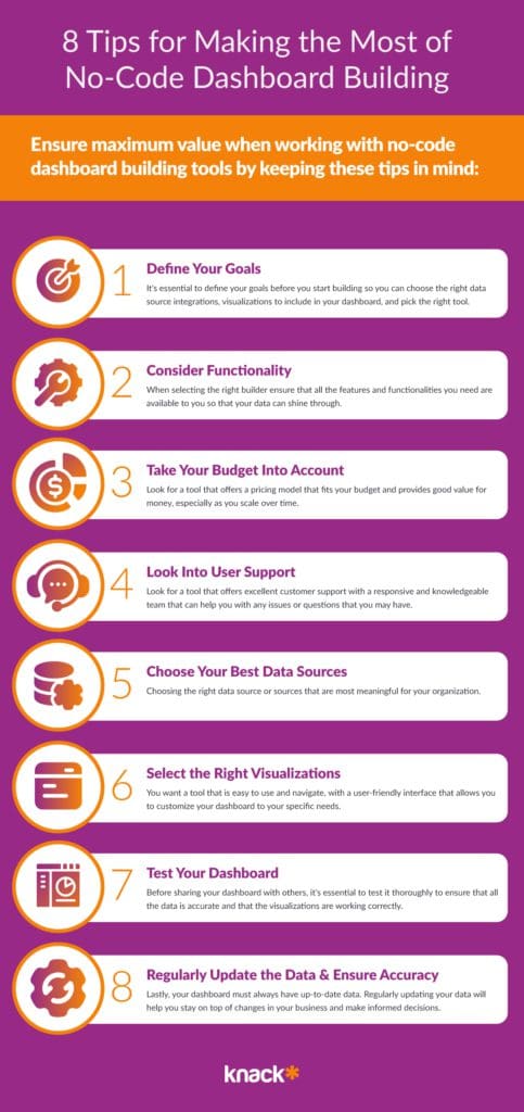
1) Define Clear Goals for Your Dashboard
Before you start building your dashboard, it’s essential to define your goals. Here are a few questions you can ask yourself to get clear on what you want:
- What do you want to achieve with your dashboard?
- Do you want to track your company’s sales performance, monitor website traffic, or keep tabs on your social media engagement?
- Are these goals measurable and realistic?
Knowing your goals will help you choose the right data sources and visualizations to include in your dashboard. Once you know what your goals are and what data to look for, you will be ready to choose your builder.
2) Explore the Functionalities of No-Code Dashboard Builders
When deciding how to build a dashboard, keep in mind that you want a tool that offers a wide range of features and functionalities that enable you to create powerful and insightful dashboards. Look for a tool that offers a variety of chart types, such as:
- Pie charts
- Bar charts
- Line charts
- Filters & Drill-downs
- and other interactive features.
This will allow you to present the data on your dashboard in a more engaging manner.
3) Build a No-Code Dashboard Within Your Budget
Look for a tool that offers a pricing model that fits your budget and provides good value for money. Some tools offer a free trial period, which allows you to test the tool and its features before committing to a subscription. If your dashboards or reports are going to be designed for external users, such as vendors, suppliers, clients, or members of a community, ensure that you select a tool that has a pricing model based on something other than users as the key pricing metric
4) Evaluate Customer Support for No-Code Dashboard Builders
Look for a tool that offers excellent customer support with a responsive and knowledgeable team of expert no code builders that can help you with any issues or questions that you may have. This will enable you to create powerful and insightful dashboards that drive your business forward.
5) Choose Your No-Code Dashboard Source of Data
Choosing the right data source is critical to the success of your dashboard! Some dashboard builders allow you to connect to multiple data sources, giving you more flexibility in choosing the right data for your dashboard.
For example, if you’re building a sales dashboard, you might want to connect to your company’s CRM system to get real-time data on your sales performance. You may also want to automate a few processes on your dashboard with Zapier or Make, or select an option with native integrations & functionality.
You need to ensure that the tool you choose can easily integrate with your data sources. This will enable you to extract the data you need and display it in a way that makes sense to you and your team.
6) Pick the Right Dashboard Visualizations For Your Audience
You want a tool that is easy to use and navigate, with a user-friendly interface that allows you to customize your dashboard to your specific needs. Look for a tool that offers drag-and-drop functionality and easy-to-use widgets that allow you to create beautiful and informative dashboards with ease.
The right visualization can make all the difference in how your data is perceived. For example, if you’re presenting to a board of directors, you might want to use more sophisticated visualizations, such as heat maps or scatter plots, to help them understand complex data sets.
That is also why it’s important to test your dashboard and get a better understanding of how it’s being perceived.
7) Test Your No-Code Dashboard & Be Willing to Iterate
Before sharing your dashboard with others, it’s essential to test it thoroughly to ensure that all the data is accurate and that the visualizations are working correctly. This will help you avoid issues when going live and could save you a lot of trouble.
8) Regularly Update the Data & Presentation in Your No-Code Dashboard
Lastly, your dashboard must always have up-to-date data. Regularly updating your data will help you stay on top of changes in your business and make informed decisions.
Now that you understand the core factors that go into successfully building a dashboard it’s important to start thinking about how your data will affect your final design.
Selecting The Right Data Types for Your No-Code Dashboard
Choosing the right chart type for your data is crucial to effectively communicate your message. The first step is to identify the kind of data you’re dealing with. There are three common types of data: categorical, numerical, and time-series data. Let’s take a closer look at each data type:
Categorical data
Categorical data refers to data that is divided into groups or categories. This type of data is often used to represent characteristics such as gender, race, and political affiliations. Bar charts and pie charts are the most commonly used chart types for categorical data. A bar chart is useful for comparing the frequency or proportion of different categories, while a pie chart is useful for showing the relative sizes of each category.
For example, if you were analyzing the results of a survey asking people about their favorite ice cream flavor, you could use a bar chart to compare the number of people who chose each flavor. Alternatively, you could use a pie chart to show the percentage of people who chose each flavor.
Numerical data
Numerical data refers to data that is expressed in numbers. This type of data is often used to represent quantities such as sales figures, height, and weight. Line charts, scatter plots, and histograms are the most commonly used chart types for numerical data.
A line chart is useful for showing trends over time or for comparing multiple sets of data. For example, if you were analyzing the sales figures for a company over the past year, you could use a line chart to show the trend in sales over time. A scatter plot is useful for showing the relationship between two numerical variables. For example, you could use a scatter plot to show the relationship between a person’s height and weight. A histogram is useful for showing the distribution of numerical data. For example, you could use a histogram to show the distribution of ages in a population.
Time-series data
Time-series data refers to data that is collected over time. This type of data is often used to represent trends such as stock prices, weather data, and customer behavior patterns. Line charts and area charts are the most commonly used chart types for time-series data.
A line chart is useful for showing the trend in a single variable over time. For example, you could use a line chart to show the trend in the stock price of a company over the past year. An area chart is useful for showing the trend in multiple variables over time. For example, you could use an area chart to show the trend in the sales figures for multiple products over the past year.
By understanding the different types of data and the appropriate chart types to use, you can effectively communicate your message and insights to your audience.
Defining Your Data Visualization Goals for Your No-Code Dashboard
After identifying the data type, the next step is to determine your data visualization goals. Each chart type is designed to accomplish specific data visualization goals. Let’s take a look at some of the most common data visualization goals and their corresponding charts.
Comparing values
If you want to compare values between different categories, the best chart type is a bar chart. Bar charts are also useful for displaying data with large and small changes.
Analyzing trends
To analyze trends and changes over time, use a line chart. Line charts are effective in showing patterns and trends in continuous data over a specific period.
Identifying relationships
Scatter plots are ideal for identifying relationships between two variables. They are useful in identifying correlations between variables and are commonly used in scientific research and data analysis.
Displaying distributions
Histograms are used to display the distribution of values in numerical data. They group data into bins or intervals and display the number of occurrences in each bin. Histograms are useful in identifying trends and patterns such as central tendency and outliers.
Improving Decision-Making with Graphs
The right graphs can make the decision-making process effortless and effective. They provide an instant view of the data, enabling decision-makers to make informed judgments quickly. When analytical skills are paired with graphical representation, it can lead to better insights. For instance, a graph can show a correlation between variables that were not apparent through tables and numbers, leading to a better understanding of the underlying problem.
Differentiating Between Graphs and Charts
Graphs and charts serve different purposes. Graphs are used for data sets that involve continuous data while charts are used for categorical data. Graphs help to represent complex data, which consists of two variables, one on the x-axis and the other one on the y-axis. On the other hand, a chart displays data in an organized table format, usually through vertical or horizontal bars or lines.
For instance, if you are analyzing the performance of a company’s stocks over a period of time, you would use a line graph to show the changes in stock prices over time. On the other hand, if you are comparing the sales of different products in a store, you would use a bar chart to display the data in an organized manner.
Charts and graphs can also be combined to create a more comprehensive representation of data. For example, you could use a pie chart to show the percentage of sales for each product, and then use a line graph to show how sales have changed over time. Ideally the pie chart quickly illustrates some core points whereas the chart would allow you to dig more into details.
Designing an Engaging No-Code Dashboard
If you’re feeling overwhelmed early on in your journey towards designing an excellent report, don’t be! There are hundreds of dashboards and reports to draw inspiration from and generally speaking templates you can easily repurpose no matter what system you’re on. Take the design process as an opportunity to form some goals around what your design can be. By following these five tips you turn even the most basic designs into an effective tool until you’re ready to invest more time into design.
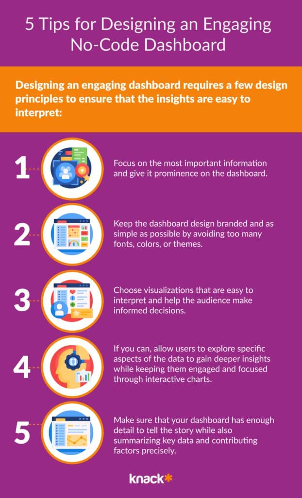
Designing an engaging dashboard requires a few design principles to ensure that the insights are easy to interpret:
- Focus on the most important information and give it prominence on the dashboard.
- Keep the dashboard design as simple as possible by avoiding too many fonts, colors, or themes.
- Choose visualizations that are easy to interpret and help the audience make informed decisions.
- Interactive dashboards allow users to explore specific aspects of the data to gain deeper insights while keeping them engaged and focused.
- The right visualization that should be used is dependent on the data you have and the insights you want to communicate. Some examples include:
- Line charts that track trends over time.
- Bar charts that share comparisons between categories.
- Pie charts that show the proportions of various categories of data.
- Maps that visualize geospatial data.
And if you’re wondering how to customize it to your brand, we have also compiled a list of tips you can adhere to further down. As with many things design related, less is more, try to focus on the data and let information tell the story until you have something you know your team is going to love.
The most common pitfalls most new dashboards have is how to specifically display the data. We’ll take a deep dive into this in our next section. If you’re a pro feel free to skip it, but for most business owners and teams trying to create a new dashboard these fundamentals can have a huge impact on whether you end up with a dashboard you’re proud of.
Selecting The Right Chart Types for your No-Code Dashboard
Charts are an essential tool for data visualization. They help us to understand complex data sets and identify patterns, trends, and outliers. Here’s an overview of 16 of the most common types of charts & graphs you may want to use:
1) Bar Charts
Bar charts are a popular choice for showing categorical data. They display the number of units/items per category and are ideal for comparing distinct categories. For example, you could use a bar chart to compare the sales of different products in a store or the number of students in different classes in a school.
2) Column Charts
A column chart is similar to a bar chart, but the columns are vertical. They are useful for showing data in groups or categories and comparing them with one another. For example, you could use a column chart to compare the revenue generated by different departments in a company or the number of visitors to a website from different countries.
3) Line Charts
Line charts use data points connected by lines. They are ideal for showing trends over time and continuous data values, such as stock market prices or weather forecasts. For example, you could use a line chart to show the changes in temperature over the course of a day or the fluctuations in material prices over the year.
4) Area Charts
An area chart is a line chart filled with colors or patterns. They are useful for showing patterns over time and cumulative totals. For example, you could use an area chart to show the growth of a company’s revenue over a period of years or the changes in the number of users on a social media platform over time.
5) Pie Charts
Pie charts are ideal for showing the percentage of distinct categories or a composition of parts. They work best when limited to six slices. For example, you could use a pie chart to show the percentage of different types of fruit in a basket or the composition of a company’s revenue from different products.
6) Doughnut Charts
Doughnut charts are the same as pie charts but have a hole in the center. They help to focus on the core information that the chart is presenting. This makes them useful when you want to draw attention to certain data points or isolate specific segments of your data. For example, you could use a doughnut chart to show the breakdown of expenses in a budget or the distribution of votes in an election.
7) Scatter Plots
Scatter plots display data as points, making them useful for displaying trends between two variables. They are great for identifying correlations or outliers in data. For example, you could use a scatter plot to show the relationship between a person’s height and weight or the correlation between the price of a product and its sales volume.
8) Stacked Bar Charts
A stacked bar chart is used to compare the cumulative data collected in different categories. This type of chart allows for comparisons within the categories represented, as well as between them. For example, a stacked bar chart can be used to compare the sales of different products in a particular region. By stacking the bars, it becomes easier to analyze the total sales of each product and compare them with each other.
9) Bubble Charts
A bubble chart utilizes bubbles to visualize data values between categories. This type of chart is best suited to display the relationship between the values of three or more variables. For instance, a bubble chart can be used to represent the relationship between the size of a company, its revenue, and the number of employees. By using different colors and sizes for each bubble, it becomes easier to analyze the data and identify patterns or trends.
10) Heatmaps
A heatmap shows a matrix of data points where the color and intensity of the color define the data values. This type of chart is best suited for the representation of data that is dependent on both categories and time periods. For example, a heatmap can be used to represent the temperature of different regions during different months of the year. By using different colors and shades for each data point, it becomes easier to analyze the data and identify the hottest and coldest regions.
11) Waterfall Charts
A waterfall chart is an ideal chart type to use when you want to show how an initial value gets modified by intermediate positive or negative values, leading to an end value. They are great for tracking progress towards a specific goal over time. For example, you could use a waterfall chart to show the changes in a company’s revenue over a period of years or the changes in a country’s population over a decade.
12) Radar Charts
A radar chart compares exactly two or more variables against a single standard unit. This type of chart allows for the comparison of multiple variables while maintaining a single reference point. For example, a radar chart can be used to compare the performance of different athletes in various sports. By using different colors for each athlete, it becomes easier to analyze the data and identify the best performer.
13) Treemaps
A treemap is a hierarchical chart that displays the data structure in the form of rectangles. This type of chart is best suited when representing complex or hierarchical data. For instance, a treemap can be used to represent the market share of different companies in a particular industry. By using different colors and sizes for each rectangle, it becomes easier to analyze the data and identify the dominant players in the industry.
14) Box Plots
A box plot is ideal for showing distribution, minimum/maximum values, and outliers in one chart. Box plots are useful when comparing data sets across categories and analyzing their central tendency. For example, you could use a box plot to show the distribution of test scores in different classes or the distribution of salaries in different industries.
15) Histograms
Histograms are ideal for displaying distribution data, identifying patterns and trends in the data, and spotting outliers. For example, you could use a histogram to show the distribution of heights in a population or the distribution of ages in a group of people.
16) Gantt Charts
Gantt charts are useful for tracking project schedules. They display individual tasks, their durations and start/end dates in a time-based format, as well as their interdependencies. For example, you could use a Gantt chart to show the timeline of a construction project or the schedule of a software development project.
17) Funnel Charts
Funnel charts are useful when you need to show the progression of data values through multiple stages. They are ideal for businesses that rely on lead generation to convert a client into a customer. For example, you could use a funnel chart to show the conversion rates of website visitors into leads or the conversion rates of leads into customers.
Hopefully you now have a firm sense of how you would best illustrate your data now it’s time to think about how to organize these different data visualizations.
Designing Effective No-Code Graphs and Charts
Graphs and charts are powerful tools for visualizing complex data and presenting it in a way that is easy to understand. However, creating effective graphs and charts is not always easy. Here are some tips to help ensure your graphs and charts are effective:
A) Use Clear and Concise Labels
One of the most important things to keep in mind when creating graphs and charts is to use clear and concise labels. Avoid using technical jargon or abbreviations that your readers may not be familiar with. Instead, use simple, everyday language that is easy to understand. It’s also best to keep your labeling simple and straightforward, using colors that contrast with each other to make it easy for your readers to distinguish between different data sets.
For example, if you’re creating a bar graph to compare the sales of different products, you might use different colors for each product to make it easy for your readers to see which product is which. You might also include a legend that explains what each color represents.
B) Choose Appropriate Colors
Choosing the right colors for your graphs and charts is also important. You want to choose a color scheme that makes it easy for your readers to distinguish between different data sets, but you also want to make sure the colors you choose are visually appealing and not too distracting.
One way to choose colors is to use a color palette generator, such as Coolors or Adobe Color. These tools can help you create a color scheme that works well for your data and is visually appealing.
C) Maintain Consistency in Design
Another important factor to keep in mind when creating graphs and charts is to maintain consistency in design. This means using the same fonts, colors, and layout throughout your graphs and charts to make it easy to comprehend the data.
For example, if you’re creating a series of line graphs to show the growth of your business over time, you might use the same font and color scheme for each graph. This will help your readers quickly understand the data and see how your business has grown over time.
D) Avoid Overloading with Information
Finally, it’s important to avoid overloading your graphs and charts with too much information. While it may be tempting to include as much data as possible, doing so can actually make it harder for your readers to understand the data.
Instead, focus on the most important data points and present them in a clear and concise way. Minimize complexity by avoiding intricate design elements and unnecessary data. This will help your readers quickly understand the data and make informed decisions based on the information you’ve presented.
E) Avoid distorting data
Ensure that your data visualization accurately represents the data you are trying to display. Avoid distorting the data to make a point or to make the visualization look more interesting.
F) Ensure that it is accessible
Ensure that everyone who needs to understand the visualization can do so, including people with disabilities. This means using alt text for images, providing captions for videos, and using accessible fonts and colors.
How to Successfully Customize and Brand Your Dashboard
Customizing and branding your dashboard gives it a unique look that’s consistent with your company’s brand guidelines. Some ways of achieving this include:
- Choose the color palette, fonts, and theme that align with your company’s branding.
- Include images that make the dashboard more engaging, visually interesting, and directly related to your business objectives.
- Include custom widgets such as buttons, dropdowns, and search bars that make the dashboard easier to use and are more aligned with your organization’s workflow and aesthetics.
The 6 Main Benefits of Using No-Code Dashboard Builders
No-code dashboard builders have become increasingly popular in recent years, and for good reason. They offer a range of advantages and here are just a few of them!
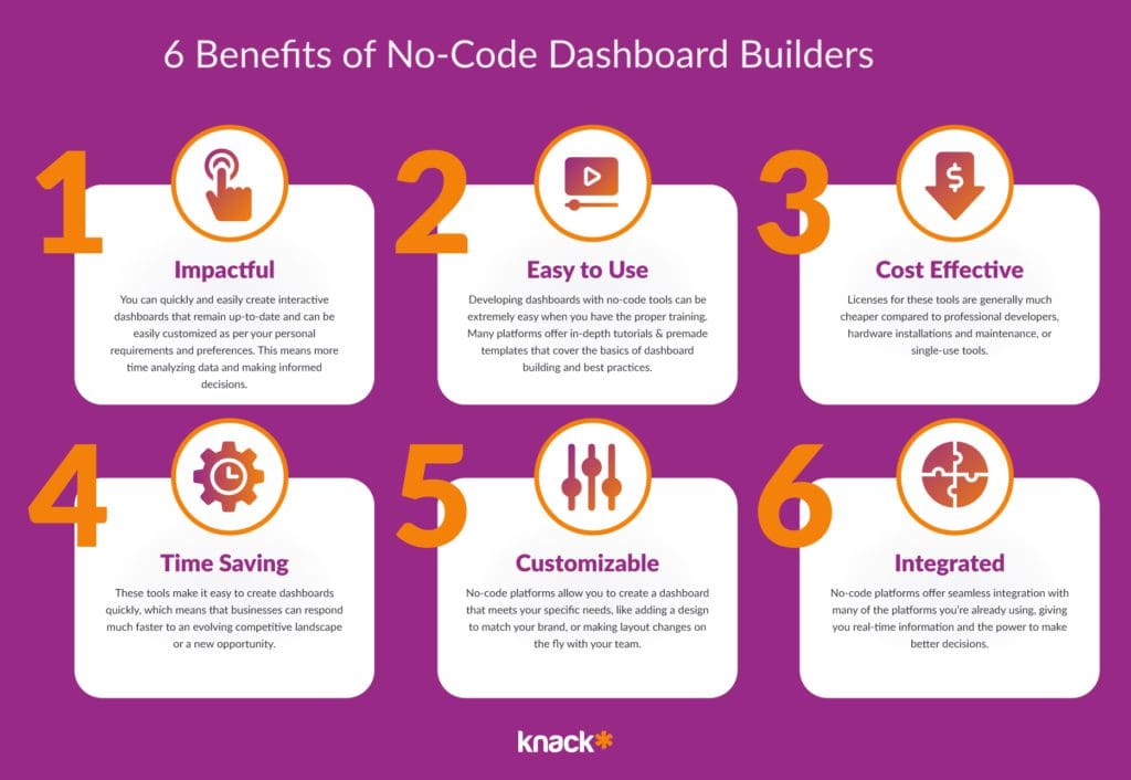
1) Increased Efficiency
You can quickly and easily create interactive dashboards that remain up-to-date and can be easily customized as per your personal requirements and preferences. This means more time analyzing data and making informed decisions.
2) User Friendly
The user interfaces and tools are simple as they offer drag-and-drop functionality, pre-designed templates, and pre-built widgets that make it easy for beginners to design personalized dashboards with minimal technical skills. This means that you don’t need to be a coding expert!
Developing a no-code dashboard can be extremely easy when you have the proper training. Many platforms offer in-depth tutorials that cover the basics of dashboard building and best practices
3) Cost Effective
Licenses for these tools are generally much cheaper compared to professional developers, hardware installations and maintenance, or single-use tools. This means that even small businesses or individuals can access these tools and create interactive dashboards without breaking the bank.
4) Time Saving
These tools make it easy to create dashboards quickly, which means that businesses can respond much faster to an evolving competitive landscape or a new opportunity. This speed can be a game-changer in industries where data insights can make all the difference.
5) Highly Customizable
These tools offer high customizability. This means that they allow you to create a dashboard that meets your specific needs, like adding a color scheme, font, and layout to match your brand. You can also customize it even further by adding CSS or Javascript to offer even more control over the UX.
6) Highly Integratable
No-code platforms offer out of the box connectivity with other platforms like commonly available Quickbooks, Google Analytics, Salesforce, Hubspot, or Zapier integrations. This allows you to have all of your information in real-time, giving you the power to make better decisions for your company.
You can use these real-time data integrations to help your company in many ways. Here are a few:
- Respond to changes in the market and make informed decisions in record time.
- Monitor social media platforms, a valuable source of information for businesses, as they provide insights into customer sentiment and preferences.
- Respond to customer feedback and adjust your marketing strategies in record time.
- Build stronger relationships with your customers by managing them better.
- Monitor IoT devices which provide valuable insights into operations and customer behavior to improve the reliability of your devices and improve your bottom line.
Now that we have covered what no-code builders for dashboards are, the industries they benefit, and how it could benefit your company, let’s get into a few tips on designing an engaging dashboard with no-code tools.
And if you’re wondering if no-code tools are the way to go for your company, here are some industries that may benefit from these types of tools:
Which Industries Benefit the Most from No-Code Dashboards?
No-code dashboards have become increasingly popular in recent years, and for good reason! They offer a way for businesses to quickly and easily gather and analyze data without the need for extensive coding knowledge.
While no-code dashboards can benefit various industries, some industries tend to benefit more than others. Here are the three industries that benefit the most from no-code dashboards:
1) Healthcare
With the vast amount of data that is generated in healthcare, from patient records to clinical trial results, having a tool that can quickly and efficiently analyze this data can be invaluable. No-code dashboards can help healthcare professionals
- Build HIPAA compliant apps & databases without costly software.
- Track patient outcomes.
- Monitor disease trends.
- Track grants, equipment, or laboratory results.
2) Finance
With the constant flow of financial data that needs to be analyzed and reported on, having a tool that can quickly and easily create reports and visualizations can save a lot of time and effort. No-code dashboards can help financial professionals:
- Track financial operations and performance metrics.
- Monitor market trends.
- Identify areas for improvement in financial management.
- Build and review budget management.
3) Marketing
Having a tool that can quickly and easily analyze marketing data can be a game-changer. No-code dashboards can help marketing professionals:
- Track campaign performance and lead management funnels.
- Monitor customer behavior.
- Identify areas for improvement in marketing strategy and key performance indicators..
4) Government
Avoid the lengthy pitches and costly infrastructure that often comes with government databases and reports.
- Build citizen portals for local governance functions.
- Track citizen services such as county plowing, parking tickets, or social program administration.
- Quickly and efficiently set up municipal payment portals.
You can learn move about government functions by reading our posts on local government apps & example no-code government apps.
5) Education
Having a tool that can quickly and easily analyze student, faculty, and materials data can make a huge impact within educational institutions of all sizes. Since employees can bring so many different skills to the fore, it’s important to keep everyone, and all students, on the same page. Use education dashboards in schools and higher ed in order to:
- Track student performance, clubs attendance, and volunteer work.
- Post, monitor, and easily adjust course catalogs
- Track and manage budget expenditures across faculty and departments.
- Manage staff, student, faculty, prospect, and alumni event registrations online, while tracking attendance.
6) Software, DevOps, & IT
DevOps and IT teams are often tasked with a huge variety of “computer” work within organizations beyond their actual scope. No-code reporting tools offer a plethora of prebuilt solutions for software teams and startups. Dashboard solutions can help you track:
- Track team performance, quality, and speed.
- Manage the hiring process, HR success rates, and manage new job listings.
- Quickly understand budget driven tasks like monitoring equipment inventory databases, payroll expenditure, POs, and build customer payment portals.
No-code dashboards can benefit a wide range of industries, but those that require real-time data and analytics tend to benefit the most. Whether it’s healthcare, finance, marketing, or another industry altogether, no-code dashboards offer a powerful tool for gathering and analyzing data quickly and efficiently.
Summary and Final Thoughts on How to Build a No-Code Dashboard
Building a no-code dashboard is a straightforward process that allows individuals and organizations to visualize data without any traditional coding. Here’s a summary of how to do it:
- Choose a No-Code Platform: Select a no-code dashboard builder that is easy to user, has robust features, and fits your budget. Knack, for example, helps you efficiently build business apps, customer portals, and online databases that get your data to the right time with the right workflows—all without code.
- Define Your Objectives: Clearly define what you want to achieve with your dashboard. This step includes determining the key performance indicators (KPIs) and metrics that are most relevant to your goals.
- Gather and Prepare Data: Collect the data you need from your existing sources and systems, such as databases, spreadsheets, or online services. Ensure your data is clean and organized to make importing it easier.
- Connect Your Data: Use the platform’s tools to connect and import your data. This step is crucial because it sets the foundation for all the visualizations that will appear on your dashboard.
- Design the Dashboard: Start designing your dashboard’s physical appearance by selecting and configuring charts, graphs, and other visualization elements. Focus on making the dashboard user-friendly and ensure that it communicates the data intuitively.
- Customize and Refine: Adjust the layout and style of your dashboard to match your branding, improve readability, and enhance the overall user experience.
- Publish and Share: Once your dashboard is complete, publish it so others can access it. Most no-code platforms offer options to share dashboards via direct links, embedded code, or scheduled reports.
- Maintain and Update: Regularly update your dashboard to reflect new data and insights. Gather feedback from users and make adjustments to enhance functionality and effectiveness.
By following these steps, you can build a powerful and informative no-code dashboard that makes data accessible and actionable.
The Future of Code is No-Code At All
No-code building tools have democratized the dashboard-building experience, enabling users of all technical levels to create customized and interactive dashboards that deliver real-time insights. Use our guide to ensure that your dashboard serves your business needs effectively, and you are on your way to proactively and effectively analyzing your data. If you’re interested, start a free trial to start building solutions today or utilize one of our app templates.


